Coin Collecting Software Review: Collector's Desktop Inventory
This is a review of a coin collecting software product called Collector’s Desktop Inventory. The software isn’t specific to coin collections, which is both good and bad. It’s good because most collectors have multiple collections and this software will allow you to catalog all of them, from baseball cards to bottle caps. It’s bad because it has to be generic, meaning it doesn’t have fields specific to coin collecting. For example, it doesn’t have a field for the grade of the coin. It has a conditions field, but the options don’t have to do with the official coin grades we use. You can always put the grade in the description or in the notes about the item, but it’s not as easy or useful as having a dropdown of official grades to choose from.
I’ll give you a complete run down below so you can make your own decision, but my executive summary is I don’t recommend it. It’s not useful enough to be worth $49.99, is fairly immature as software and just isn’t compelling enough for me to recommend.
For instance, when you start the program it asks you to fill in your profile. One of the fields is the year you started collecting, but after filling it in and saving, that field wasn’t saved. When I opened my profile again, it was back to 2009. Another bug I ran into was when I used an apostrophe in the ‘Place of Purchase’ field. The moment I typed the apostrophe (and I did it multiple times to make sure it wasn’t just a quirk), an SQL exception popped up saying the application had gone awry. I’m okay with errors like these with a free product, but you shouldn’t have to deal with such things using a paid application.
It wasn’t all bad. The application looks nice, with several color themes to choose from and the collection overview screen is appealing too. I can also see the reports being useful if you take the time to create your own. But aesthetic appeal and custom reports isn’t enough to make me recommend it for the price. In the end, this application came up wanting.
Here’s the complete rundown of the program.
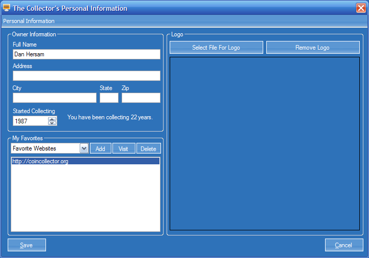 When you first run the program you’re presented with a profile screen where you can enter your name and address, when you started collecting, favorite web sites (of course I added this site :) and a logo.
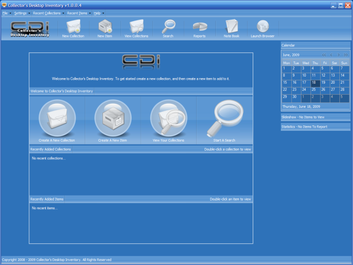 The main screen shows recently added collections and items, as well as a monthly calendar. There is also a slideshow and statistics once you’ve added your items.
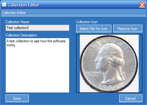 To create a collection you enter the name and a description. You can also add an optional icon, for which I chose a fairly generic 1964 Washington Quarter.
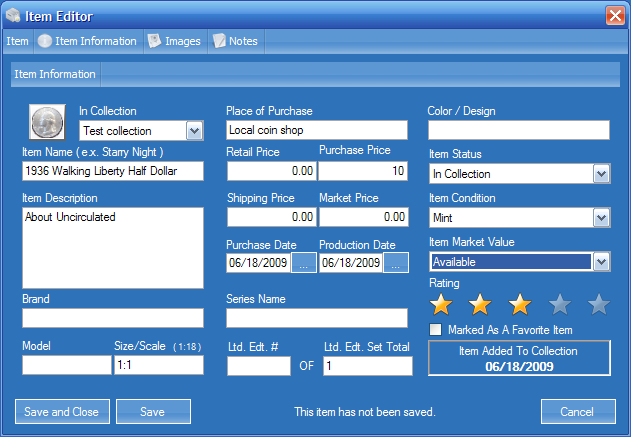 Once a collection has been created, you can begin adding your items. This is the meat of the product, as it determines what you can store for each item in your collection. As you can see, many of the fields are meaningless for a coin but would be useful for other collectibles. After you’ve saved an item, the values in the fields are available to subsequent items without having to type them in. This makes things go a little quicker for things like Place of Purchase that may apply to lots of your coins. Still, the process of adding only five coins was more labor intensive than I would have liked.
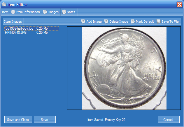 Once you’ve saved an item, you can add any number of images. This is a nice feature and adds to the eye appeal of your digitized collection after you’ve gone through the drudgery of adding everything. Confirmation dialogs could be reduced to speed up the process of adding items. If you have several hundred coins in your collection, it would take quite some time to enter them all in. Many of the confirmations aren’t particularly useful, like when you select a default image for an item, it pops up a dialog. I could do without the extra clicking.
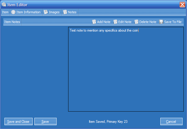 As you can see, here is where you can add additional notes about the coin. I don’t know offhand what I’d put here. Maybe funny stories about how I got the coin? I’m sure you could think of something.
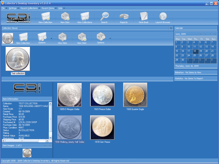 Once you’ve added items to a collection, this screen displays them all. The left panel shows the detailed information of the selected item. Below that it shows images, though I’m not sure why it doesn’t display all the images since the thumbnail is so small. A half dozen or more tiny thumbnails could easily be shown there.
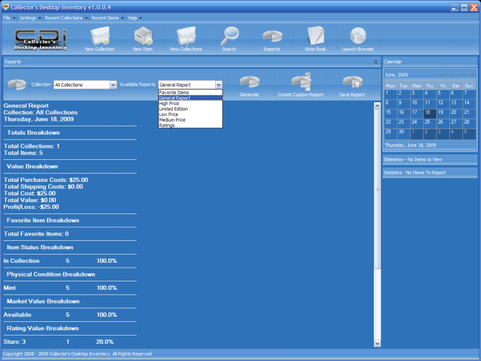 The reports are too generic to be all that useful to coin collectors, but it’s a nice idea and might be more interesting if you had your entire collection instead of a few sample entries. You can also create custom reports to provide more useful information if you so desired.
And that about covers it.